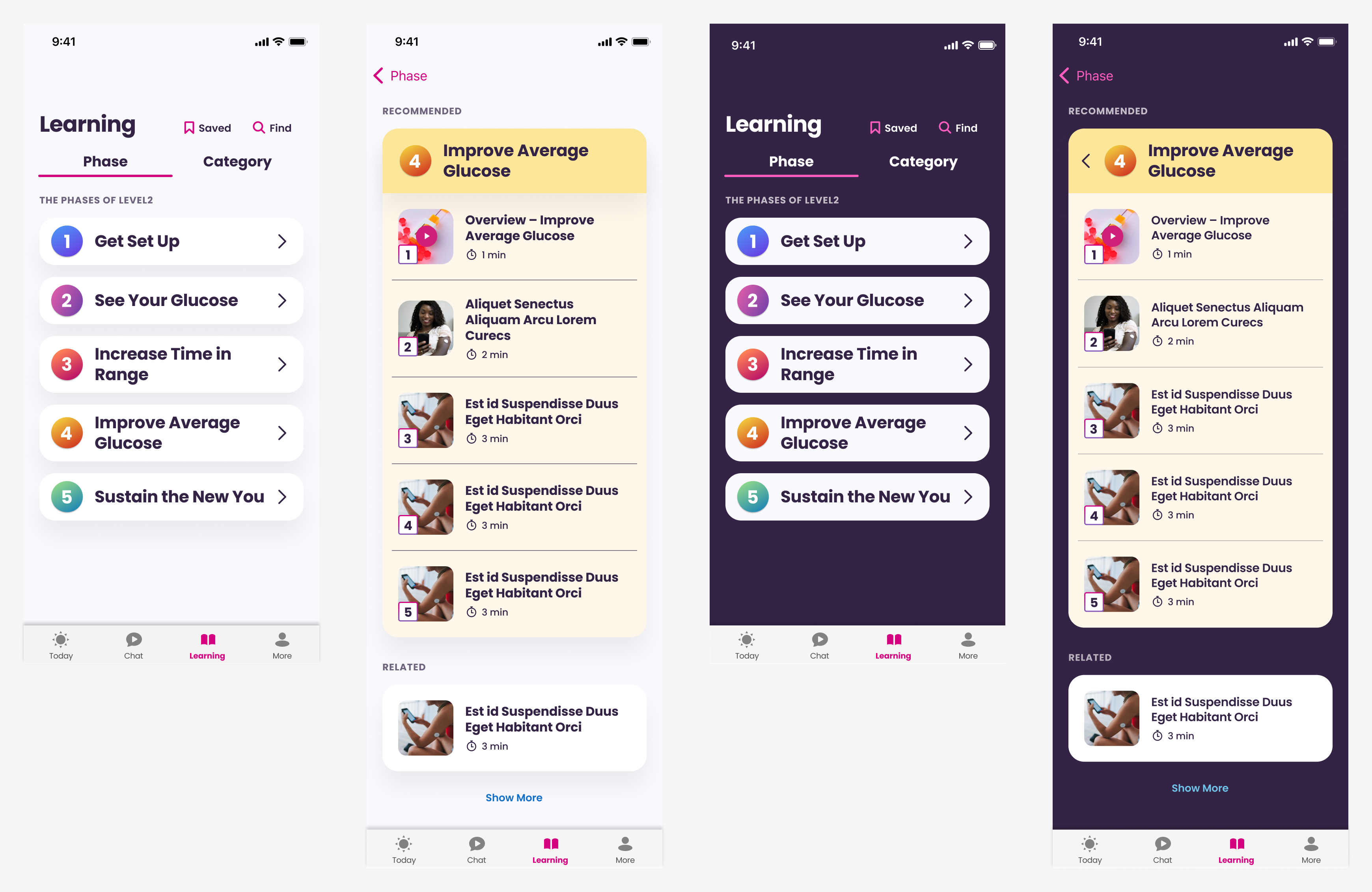
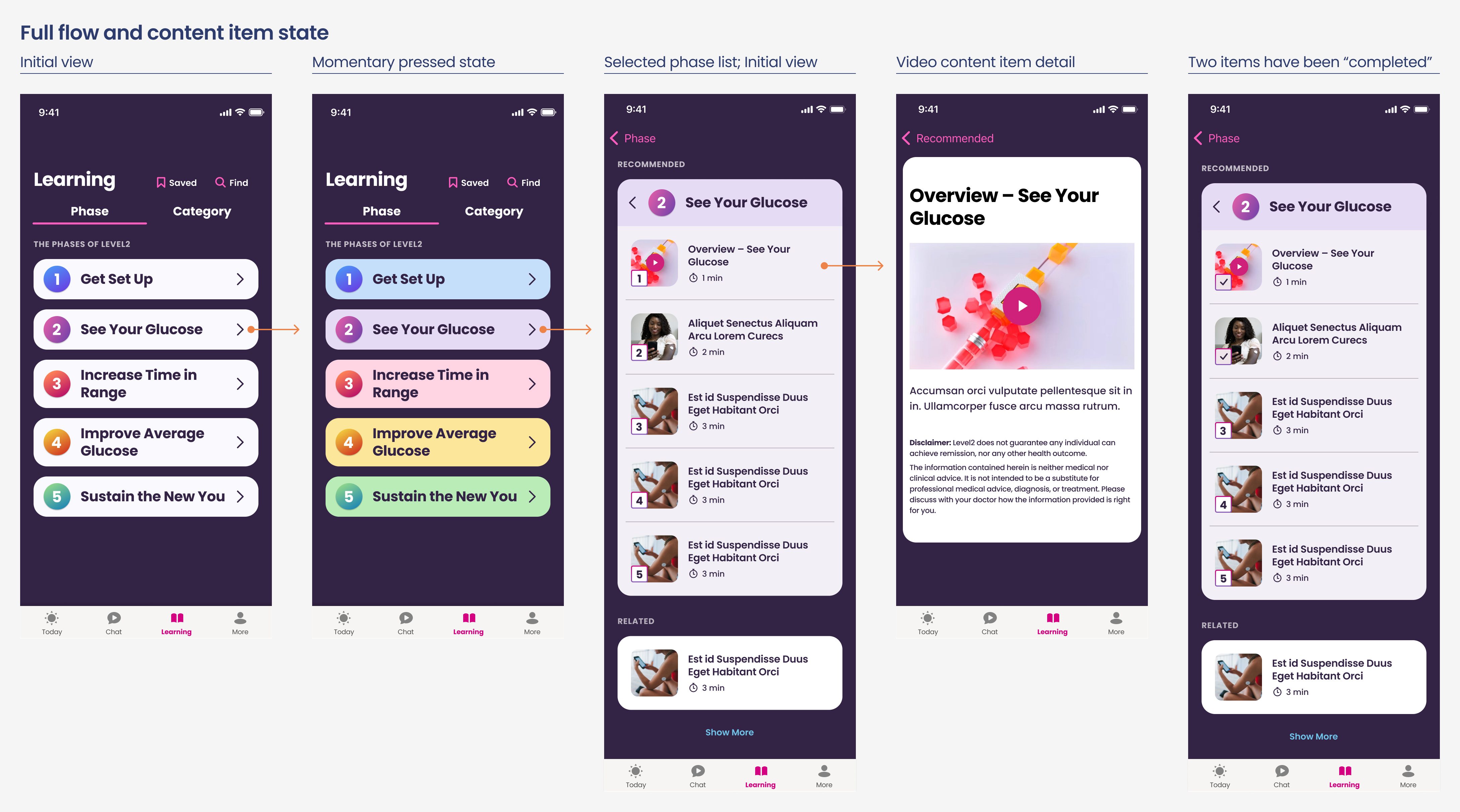
The Level2 method is a series of phases and was going to be the recommended (and default) view of the section. I researched a number of content structures and worked through other ideas that were shared with the cross-functional team.
This was the “passing” first take on structure, section navigation, and in-screen navigation.

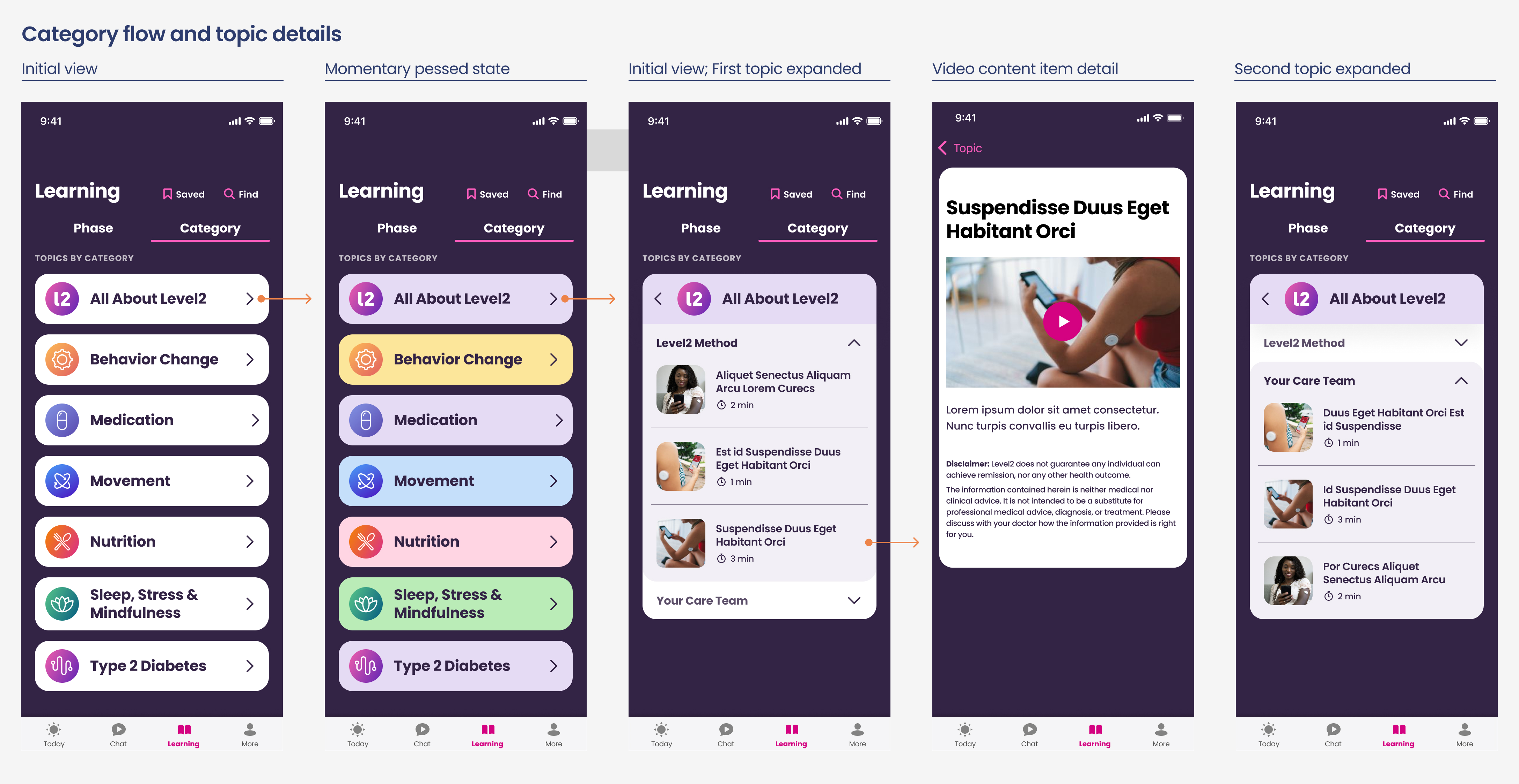
The alternative content navigation provided grouping by category and topic. Illustrating a first take on how the subgrouping navigation could function. Content creation was simultaneously in-progress and I worked with our Content Director for their initial outline of categories and topics for potential label and title length considerations for the UI elements.

User research indicated that a “Save” function was desired along with laying the initial groundwork and functionality for a “Find” function. I love working through the first versions as a solid visual reference point for conversations with product, content, and development teams.


I applied some initial styling to the now updated wireframes and assembled a simple prototype of the content structure and navigation in Figma. This was shared with the internal team for continued conversations and feedback and queued up for user testing with existing members.
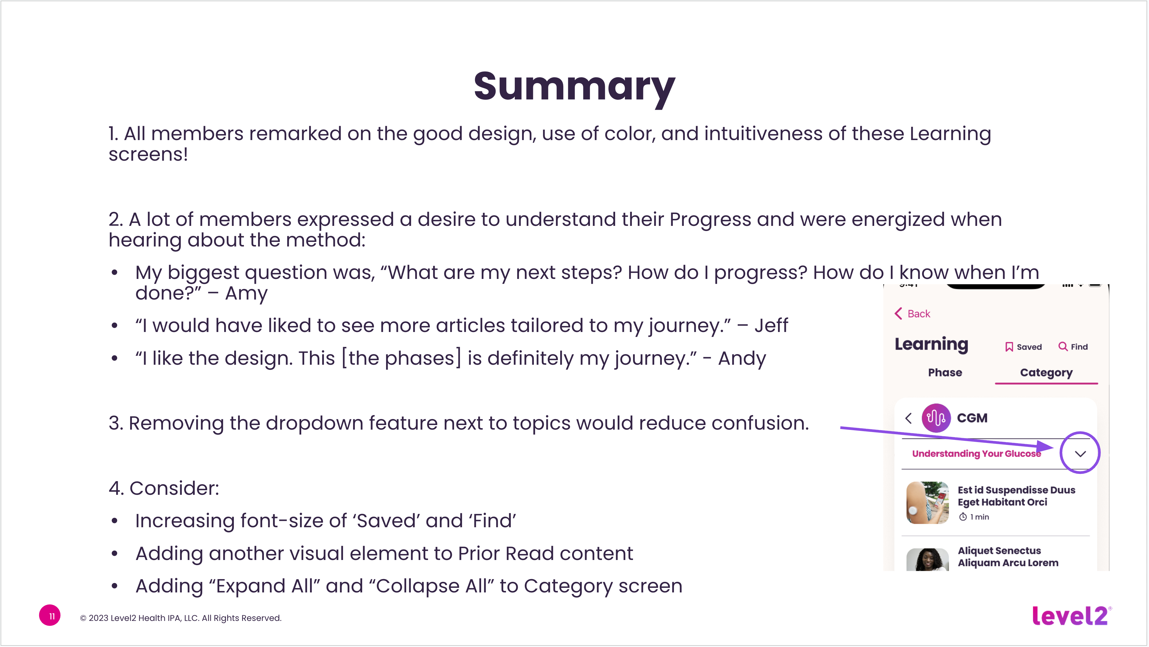
With a goal to assess the usability of the new Learning screen content and navigation we conducted moderated user interviews (30 minutes each) with six members. We received positive feedback from all six and continued to move ahead with the aesthetic design.
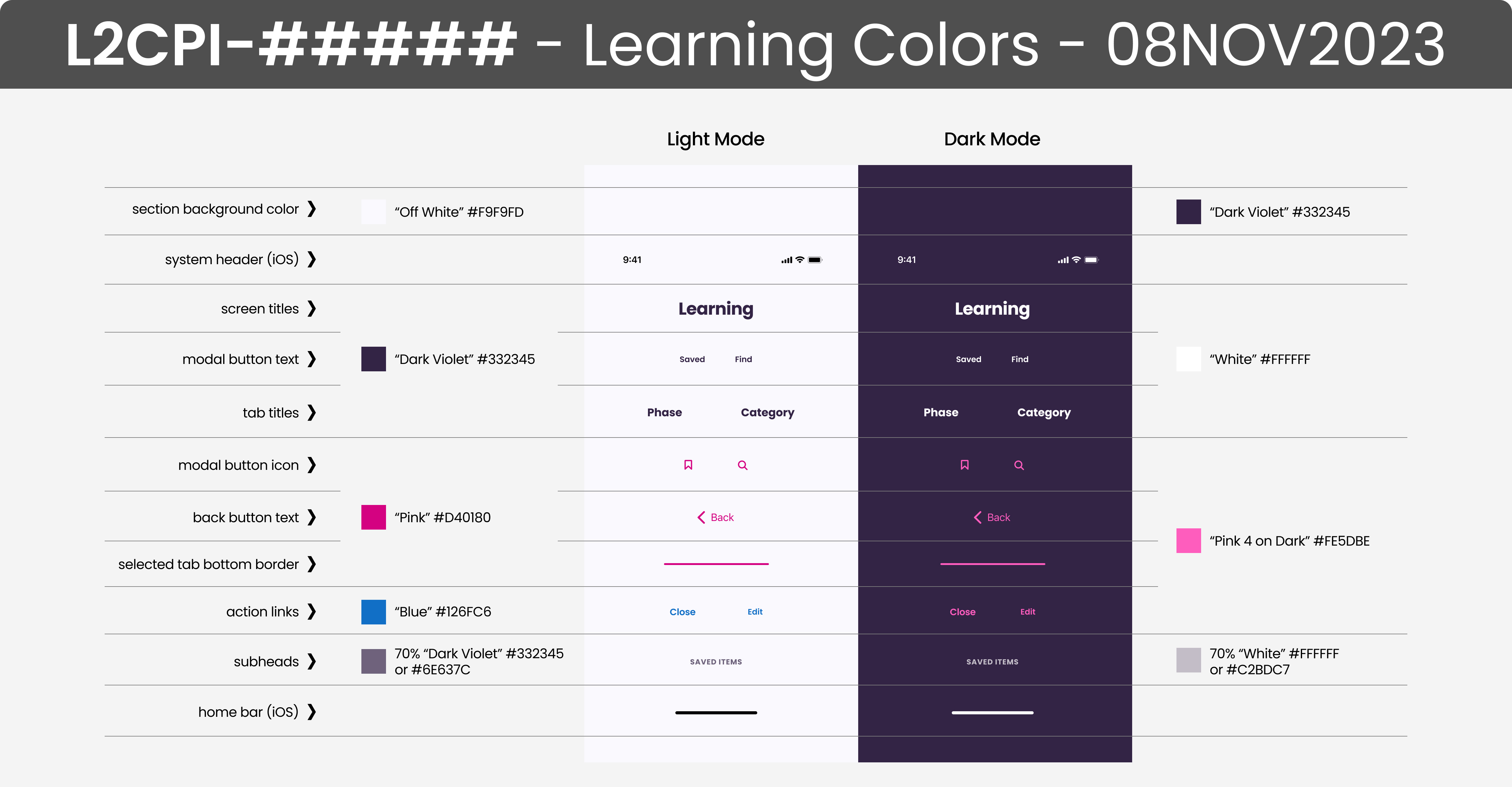
This project also made for the right time to start properly working through the Light and Dark modes of the app. There was an existing single dark mode and I worked with the dev teams to came up with a solution that enabled a streamlined mode swap that changed a limited number of base elements. Greater exploration for additional content color changes was slated for a future effort.


This prototype pulled the final designs together along with further evolution of the Saved and Find screens that required a slightly different approach to work within the constraints of the existing app development model.
The process that worked best for the native development teams was to capture all the pertinent details into one shareable (as an attached PDF in JIRA) and linkable (link back to Figma in JIRA story) artboard. This requested artboard shows all the app cards in one view to help with their building of base and extensible UI cards.

A number of good content articles already existed in a WordPress blog and direction was provided to the development team for the needed template edits to optimize the content for display in the app. This provided a way to quickly leverage existing content with future plans to move those articles to the Contentful CMS used for the app.

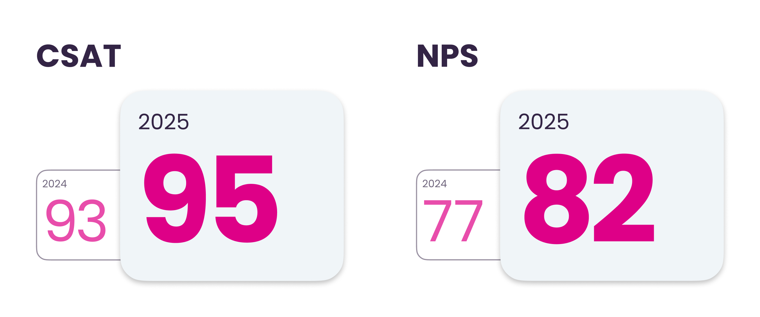
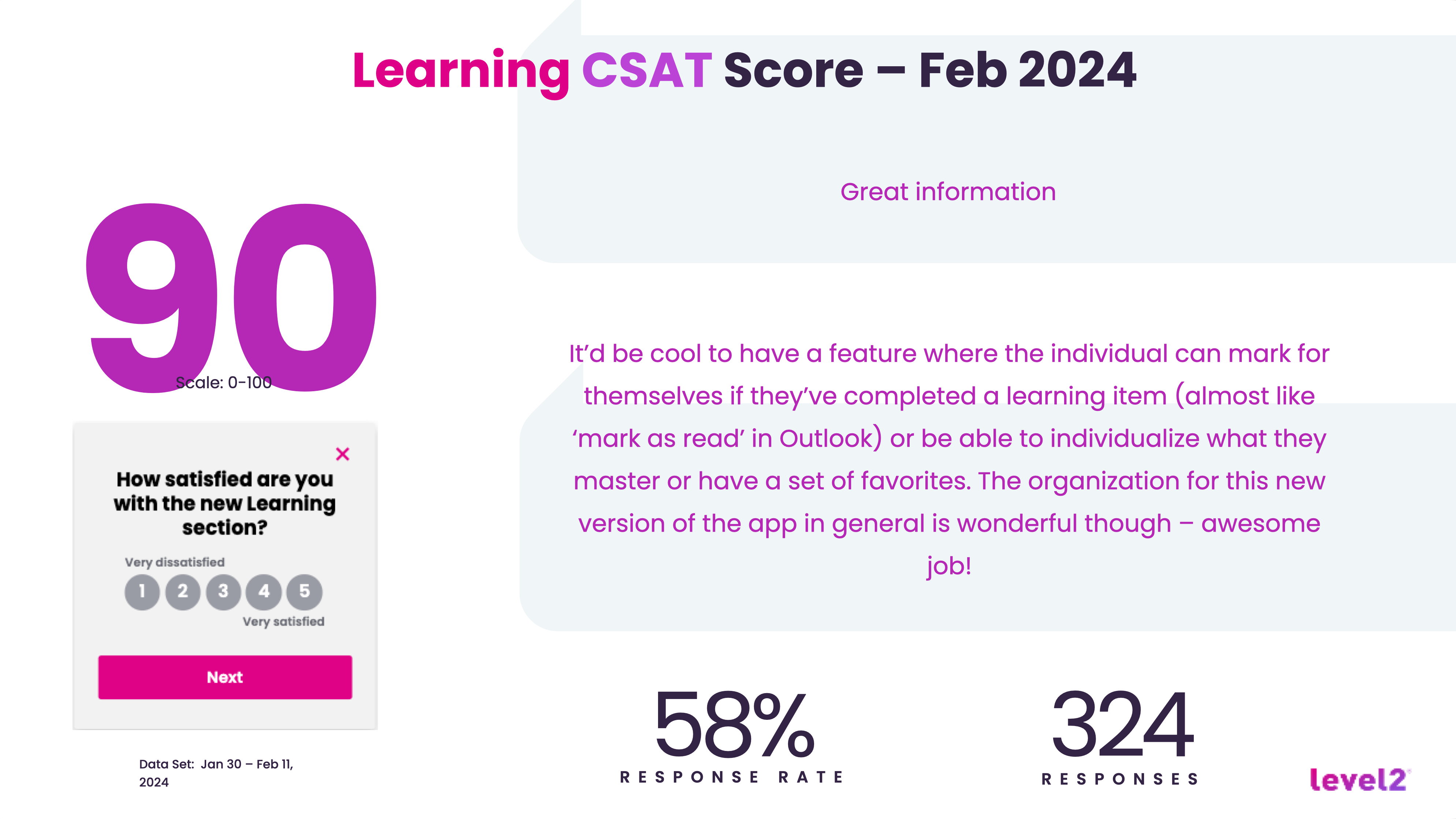
The launch of the new Learning section was well-received by Level2 members with a CSAT of 90.
I recently learned that both the NPS and CSAT have improved since the launch of the Learning section over the past 18 months. There have only been minimal updates to the app since my departure as the last designer with a RIF in April, 2024.